Worried about the University of California?
eschwitz.substack.com
Worried about the University of California?

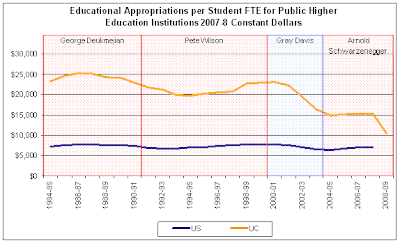
... this graph says it all. The blue line is below the yellow line because the blue line indicates the national average for all public higher education, including lower tier universities and two-year community colleges.